

Color Theory Part 2: Exploring the Harmony of Complementary Colors
Welcome to part 2 of my color theory series. If you missed part 1, where I talk about what color is, how we see it, and define some basic color theory terms, you can check that out here:
Today, I will review a few more color theory concepts in this blog, mainly related to complementary colors. Then, I will examine master artists’ works to discuss what we have learned thus far.
Explaining More on the Color Wheel
Below is a picture of the color wheel I recommended in the last blog. Looking at this graphic will help you visualize what I’m discussing. This picture references the other side of the color wheel I showed in Part 1.
Here is the link to the color wheel on Amazon: Color Wheel

Complementary Colors

The top row shows primary colors and their secondary complementary color; the second row shows secondary colors and their tertiary color complementary colors.
Complementary colors are pairs of colors that sit opposite each other on the color wheel. The “main” complementary colors consist of a primary color (red, blue, or yellow) and a secondary color (green, orange, and violet)
Complementary colors are:
Red and Green
Blue and Orange
Yellow and Violet
Those listed above are the most common complementary colors that you will hear about, however, when you spin the color wheel a complementary pair is anything opposite from each other.
So the other complementaries you can have using this specific color wheel are the following:
Red-orange and Blue-green
Red-violet and Yellow-green
Yellow-orange and Blue-violet
Reasons Artists Use Complementary Colors
You may want to choose complementary colors when planning your piece deliberately for many reasons. We will look at some below along with specific examples of each.
Create Contrast:
Complementary colors provide the highest contrast level when placed next to each other. This contrast can help elements in the painting stand out and create a visually dynamic composition. See the Matisse painting below.
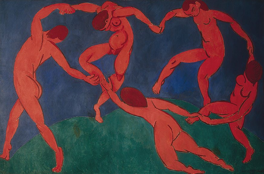
Le Danse, Henri Matisse, 1910.
Henri Matisse was a French artist who, alongside Andre Derain, developed the short-lived Fauvism art movement from 1904 to 1908. Matisse believed that artworks should be simplified representations of real life. During the early 1900s, he was drawn to using flat, simplified shapes and bold colors that often bore no resemblance to an object’s actual color.
Le Danse (The Dance) is one of his most famous works, which typifies this period of his work. Note the bright red dancers dancing on green land with the blue sky in the background. I believe the colors are more bright in person, but the image above was a free image downloaded from Wikipedia.
His use of complementary colors (red and green) is somewhat jarring to our eyes. He was not going for subtlety when he painted this piece. You may notice that complementary colors stand out most when they are as close to an original hue as possible (more saturated and have not been mixed) and when placed adjacent.
His message in this painting was an ode to joy, life, and physical movement. He created a companion piece to this painting called The Musicians, using a similar color scheme.
2. Enhance Depth and Dimension:
By using complementary colors in highlights and shadows, artists can create the illusion of depth and three-dimensionality in their paintings. The contrast between warm and cool tones can make objects appear more lifelike and give the impression of light and shadow.
Let’s look at a famous painting by Georges Seurat below that exemplifies this concept.

Un dimanche après-midi à l'Île de la Grande Jatte (A Sunday Afternoon on the Island of La Grande Jatte), Georges Seurat, 1884-1886.
Georges Seurat was a Post-Impressionist painter who was born in 1859. Sadly, he lived a short life, dying of pneumonia at the age of 31.
Seurat was fascinated by how people perceive colors, drawing inspiration from the color theories of experts like Michel Eugène Chevreul and Ogden Rood (I will touch on the contributions of these pioneers in a future blog). He believed that by using tiny dots or small brushstrokes of different colors, the human eye would blend them, creating the illusion of a single shade or hue. This technique, known as Divisionism or Pointillism (Seruat favored the term Divisionism), was his preferred method because he thought it would make the colors in his paintings appear more brilliant and powerful than traditional brushstrokes.
He started incorporating this approach around 1885–86, using dots of various sizes to achieve his desired effect. To enhance the impact of this painting, he surrounded it with a border of painted dots placed in a pure white wooden frame.
Seurat used unmixed paints of pure spectral colors, applying them in small strokes or points positioned closely together. This technique aimed to create color impressions not through palette mixing but by overlaying pure colors directly onto the eye's retina.
He developed a very scientific approach to his painting. This is precisely what he thought about when planning for a piece:
The local color of the object
The color of the light (was it a warm or cool light- For example, an indoor lightbulb may cast a yellowish, warm hue)
The color of the shadows (which is dependent on the color of the light)
The reflected colors from surrounding objects
The influence of complementary colors
Note the detail of the painting below, where you can see tiny points of pure pigment. He often used complementary colors to make his paintings “flicker.” In this small detail, he painted blues next to oranges and greens alongside reds in the girl’s head.

If you are interested, watch this short video about the painting by the Art Institute of Chicago. It’s a little over 2 minutes long.
3. Evoke Emotion:
Different color combinations can evoke different emotional responses in viewers. Due to their high contrast, complementary colors often create a sense of tension or excitement. Artists may use this to convey a particular mood or atmosphere.
See what you think of this painting before I share what Van Gogh said.
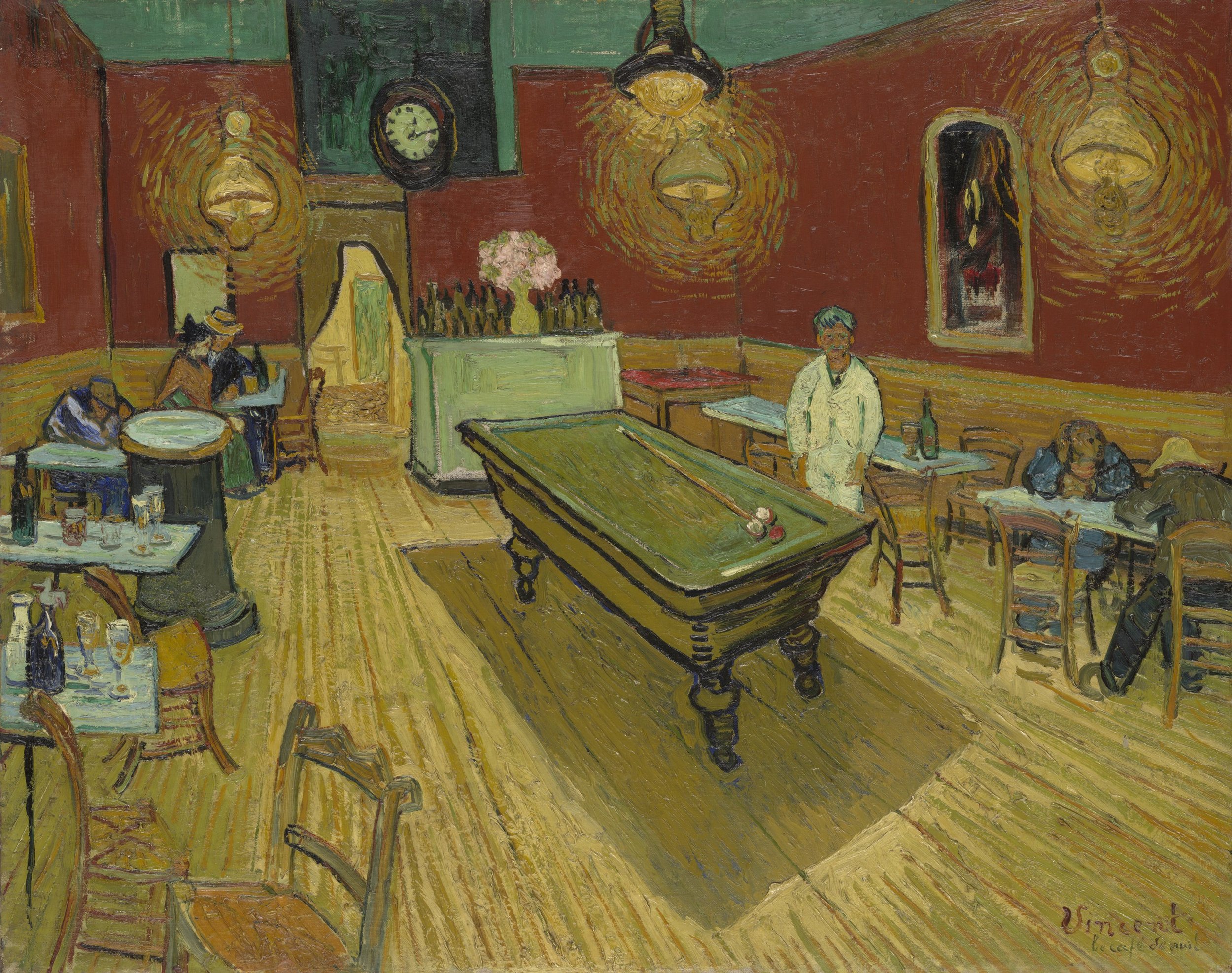
It’s not one of his prettier works, is it? That was deliberate. He used complementary colors (red and green) to make it uncomfortable to view to convey a message.
Here’s what he said:
In my painting of the night café I’ve tried to express the idea that the café is a place where you can ruin yourself, go mad, commit crimes. Anyway, I tried with contrasts of delicate pink and blood-red and wine-red. Soft Louis XV and Veronese green contrasting with yellow greens and hard blue greens.All of that in an ambience of a hellish furnace, in pale sulphur. To express something of the power of the dark corners of a grog-shop. And yet with the appearance of Japanese gaiety and Tartarin’s good nature.
He used to eat at this Cafe. Once, he described it to Theodore in a letter, “blood red and dull yellow with a green billiard table in the center, four lemon-yellow lamps with an orange and green glow. Everywhere, there is a clash and contrast of the most disparate reds and greens.”
The clashing colors were also meant to express the “terrible passions of humanity” because prostitutes and vagrants frequented the Cafe. Van Gogh was also fascinated by how colors appeared in gaslight. In this painting, he wanted to show how “the white clothing of the café owner, keeping watch in a corner of this furnace, becomes lemon yellow, pale and luminous green.”
4. Harmonize Color Schemes:
Incorporating complementary colors into a painting can help balance the color scheme and create visual harmony.
Many artists have created beautiful pieces using complementary colors, but if you know me, you know I love Van Gogh… So here is another Van Gogh example. This painting is very pleasing to the eye, which testifies to Van Gogh's skill as a color connoisseur.

Six Sunflowers, Vincent Van Gogh, August 1888.
Oh my goodness, I wish I had this one in my house. Look at the harmony created by his selection of orange and blue hues. I love it. It has a bit of a tale...
Here is Vincent’s description of Six Sunflowers: “Three flowers, one flower that’s gone to seed and lost its petals, and a bud on a royal blue background.”
Six Sunflowers was the first Van Gogh artwork purchased by a Japanese collector, Koyata Yamamoto, in 1920. He was a prosperous cotton trader who lived in Ashiya, near Osaka. At the time, he paid around $4000 for the piece. He displayed the painting above his sofa, which featured an elaborate gilded frame.
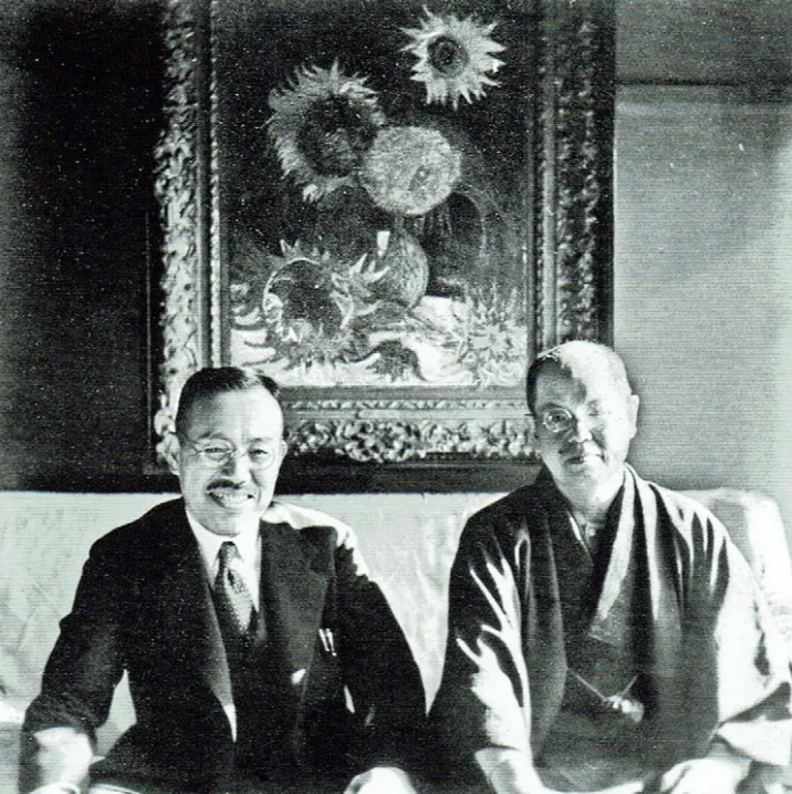
Koyata Yamamoto (left), with the writer Saneatsu Mushakoji, in his Ashiya home, 1938. Photo from Mushakoji Saneatsu Memorial Museum, Chofu, Tokyo.
On August 6, 1945, the day the atomic bomb devastated Hiroshima, Ashiya also suffered destruction in a separate American attack. As a result, Yamamoto’s house burned down with everything in it. Thankfully, Yamamoto was able to escape and lived until 1963.
Before the war, very few of Van Gogh's paintings had been captured in color photographs. Fortunately, Six Sunflowers was an exception.
Martin Bailey, a curator and correspondent for The Art Newspaper, discovered the photograph while researching his book, The Sunflowers are Mine: The Story of Van Gogh's Masterpiece.
Initially, Bailey was confused by the orange border surrounding the piece. He was reassured after he could track down Van Gogh’s thoughts on the painting, which were recorded in his letters to fellow artist Emile Bernard. Below is a statement by Bailey on his discovery:
I went back to Van Gogh's letters and he described when he was painting the sunflowers how he was going to put them in an orange frame. That has never been seen before. Van Gogh loved complementary colors, like blue and orange, together. He was really creating a total work of art, framing his picture. We can actually see how Van Gogh wanted to present his sunflowers. We can see the painting as Van Gogh wanted to be seen. It was a revolutionary idea at the time, framing a painting in orange. Conventionally, paintings were framed in gilt frames, and modern paintings were sometimes framed in plain white frames. It showed what imagination and flair he had in doing something that was rather bold and would have actually appeared shocking. He wasn't frightened of that. He was really using his imagination.
Here is the actual snippet of the letter from Van Gogh to Emile:
I’m thinking of decorating my studio with half a dozen paintings of Sunflowers. A decoration in which harsh or broken yellows will burst against various blue backgrounds, from the palest Veronese to royal blue, framed with thin laths painted in orange lead. Sorts of effects of stained-glass windows of a Gothic church. Ah, my dear pals, we crazy ones, let’s anyway enjoy with our eyes, shall we?
I’m so grateful we have the letters Van Gogh wrote to his brother and friends explaining his thought process.
Moving on to one more way artists use complementary colors to their advantage.
5. Add Visual Interest/Focus Attention
The artist can cause the viewer to focus on particular objects due to color choice. Contrasting complementary colors can create intriguing optical effects and patterns that captivate the viewer's attention.
Let’s investigate this technique by looking at the artist De Chirico and one of his paintings, The Love Song, which he painted in 1914.
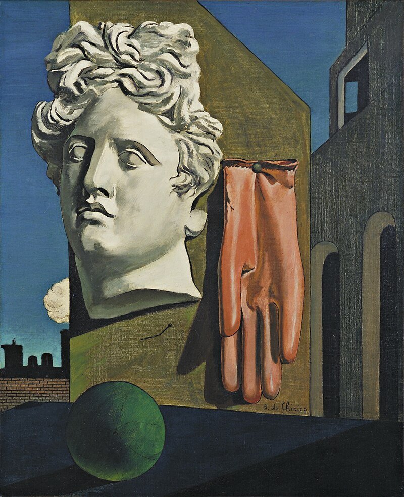
The Love Song, Giorgio De Chirico, 1914
But first, a little about the artist. De Chirico was an Italian painter who was born in Greece in 1888. His family lived there because his father was an engineer hired to develop the railroads in Greece at that time. Therefore, this is where he grew up. You will see references to classic Greek architecture in many of his paintings.
De Chirico and his compatriot, Carlo Carrà, began the short-lived Metaphysical art movement, which influenced the Surrealist painters who followed. De Chirico and Carrà sought to depict scenes that transcended mere physical reality, delving into the realms of the subconscious. They used art to address questions concerning existence, the nature of being, the relationship between mind and matter, and the ultimate nature of reality itself. They wanted to explore concepts such as causality, identity, time, space, and the existence of abstract entities like numbers and universals. De Chirico was heavily influenced by thinkers and writers such as Friedrich Nietzsche, Edgar Allan Poe, and Sigmund Freud. You can see these influences in his odd works, which can be seen as an attempt to grapple with the mysteries of existence and the human condition.
In this particular painting, de Chirico utilizes complementary colors to enhance the sense of depth and atmosphere. For example, the foreground features warm, earthy tones such as ochre and brown, complemented by cooler blue and green hues in the background. This contrast between warm and cool colors adds depth to the composition and creates a sense of spatial tension.
Furthermore, complementary colors enhance the scene's dreamlike quality. The composition of unlikely objects and the heightened color contrast (red glove and green ball) contribute to the painting's overall sense of mystery. The complementary colors draw the viewer's attention to the various elements of the composition, inviting the viewer to contemplate the meaning of the objects.
De Chirico often didn’t explain the meaning of his paintings, so we can only go based on our own interpretation or on scholars. I don’t want to leave you high and dry on a scholarly analysis of the symbols, so here that is:
The classical bust symbolizes the enduring legacy of ancient civilization and the pursuit of beauty. The empty, red rubber glove introduces a sense of mechanization or human absence. The green ball's vibrant color and spherical form suggest themes of playfulness or the subconscious, while the distant train hints at journeys, progress, and the passage of time (and also a nod to his father’s job).
Conclusion
Various factors come into play when considering complementary colors for your artwork. They offer the highest contrast when placed right next to each other, enhancing visual dynamics and emphasizing elements within the composition. Henri Matisse's Le Danse exemplifies this contrast with its vibrant red dancers set against a green landscape. Georges Seurat's technique employed complementary colors to heighten depth and dimension, creating lifelike illusions through subtle color blending. Vincent van Gogh, known for his expressive color choices, deliberately used complementary colors to evoke emotions in The Night Café, where reds clash with greens to convey a sense of unease and tension. Van Gogh also illustrated the harmonizing effect of complementary colors in Six Sunflowers, framing orange hues against a blue background for visual balance. Finally, Giorgio de Chirico's The Love Song used complementary colors to draw attention and create a dreamlike atmosphere, inviting viewers to interpret the symbolism of its enigmatic objects—a classical bust, a red rubber glove, a green ball, and a distant train—within the context of their metaphysical significance.
I hope you have found this deep dive into five famous art pieces as instructive and helpful as I have. For my next blog, I will continue to explore color theory to discover practical applications that can help us improve our art and make it more meaningful. In the meantime, if there is a topic that you would like me to look into, such as more on color theory or otherwise, let me know in the comments below.