4 Master Soft Pastel Artists & 4 Ways To Improve Your Art

From top left to bottom right: Degas, Redon, Toulouse-Lautrec, and Carriera.
I have recently been getting excited about soft pastels. I love how bright their colors are compared to colored pencils. I also enjoy how they cover the paper more efficiently. I can create more works in less time, which I think is key for me to grow as an artist.
If you are interested in seeing how I use pastels and colored pencils together in a piece, click on this link for a free tutorial:
Free Snow Cardinal Mixed Media Tutorial
As I begin to learn new tricks and techniques to improve my artwork using this media, it has me thinking about famous pastel artists. It’s been a minute (lol) since I took art history in college, so it’s time for a refresher!
Here’s what I’m looking into today- Who were the pioneers of this medium? What did their artworks look like? And… what can we learn from them?
Let’s get right to it.
Edgar Degas (1834–1917)
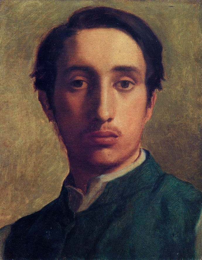
Self portrait of Edgar Degas, 1857, oil.
I love the French Impressionist artists. Edgar Degas included, although I’m not into ballet as a subject matter (however, I love his horse works!). l admire his work and how he pushed the boundaries with his photo-like compositions, use of looser brush strokes, and his choice of color.
Degas created works in oils, but he is also famous for his significant contributions to pastel art. While he didn't necessarily pioneer the use of pastels, he played a crucial role in popularizing and innovating the medium.
He used pastels to convey the fluidity and grace of dancers in motion. Perhaps the series where he captured the essence of movement the most would be his ballet dancer pieces. He was able to do this with gestural strokes and dynamic compositions. See the below pastel painting for an example of this.
While Degas was known for his bold experimentation with color, he also appreciated subtlety. In this painting, he uses a restrained color palette, focusing on softer tones that enhance the ethereal quality of the scene.
He achieved a high level of detail on top of the original pen drawing. One of the great things about pastels is that you can create details or choose to use broad strokes. He used both techniques on this painting.
Note how he used looser strokes for the background scenery for the dancers. He gives the illusion of greenery, but we cannot see details. In some parts of this piece he was very sparse with the pastel application and you can see the surface shining through. He used more detailed strokes to create the dancers which helps to focus our attention on the action in the scene.
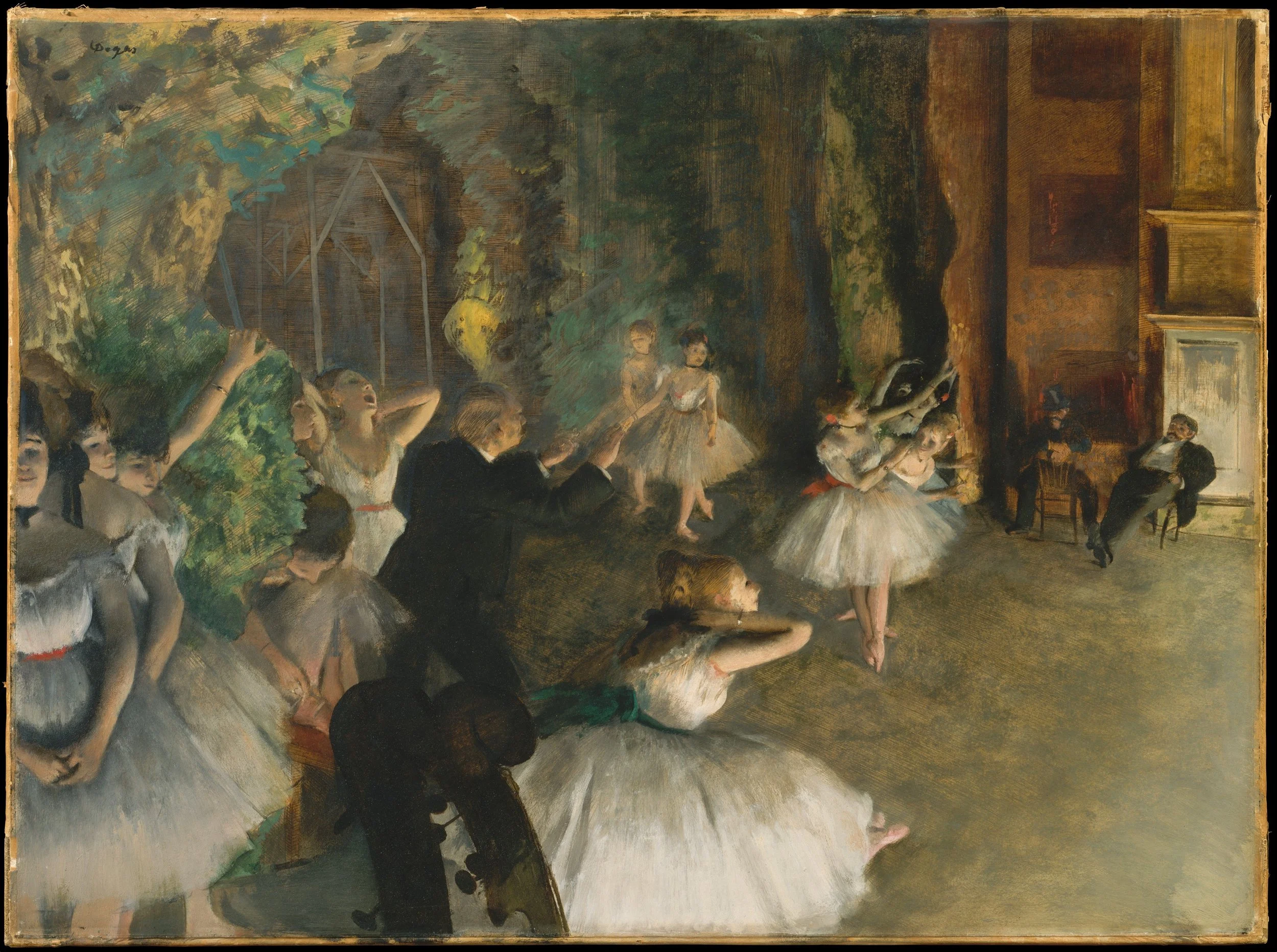
Edgar Degas, The Rehersal Onstage, 1874, pastel over pen-and-ink drawing on thin cream-coloured wove paper, laid down on bristol board and mounted on canvas.
Let’s look at another mixed media by Degas to see how he used pastels to depict everyday life for the lower class.
Later in Degas’ career he focused on the chore of ironing for many pieces. Below is an example of one of these works. For this piece he used oil and pastels to portray the mundane nature of ironing. I’m happy to say I never iron except for maybe a wedding or a funeral, but that is neither here nor there for this discussion…
The first woman is yawning and stretching, one hand holding her head, the other a bottle of wine. There's no laundry or iron in front of her. She looks tired and hot. Her companion keeps at her task. The gestures are well-observed. The yawn looks natural, and the ironing seems real. The contrast between the first woman's upward motion and her colleague's downward motion stands out.
The realist impact is emphasized by the textured, unprepared canvas, and the colors don't glamorize the women. Degas uses pastel with a bit of roughness, letting the raw canvas show, making the pastel colors stand out even more.
In this piece, he uses a distinctive color palette that deviates from realistic representation. The background, instead of being a traditional neutral or warm tone, features shades of green and blue. The ironing board and the woman's clothing are rendered in muted tones with subtle variations of grays and browns. The use of cool, non-literal colors creates an atmosphere that is both contemplative and detached. The work is a testament to Degas' ability to incorporate a sense of abstraction through his unique use of color in pastels.

Edgar Degas, Women Ironing, 1884, pastels and oils on canvas.
Here is a horse pastel piece by Degas.
Throughout his career, Degas rendered racing scenes. From one piece to the next he would vary positions of the horses and jockeys. The figures in this composition can be traced back to earlier pieces, with some poses drawing from sources even more distinguished than the horses themselves. For instance, the prancing mount and rider at the center are inspired by Benozzo Gozzoli's "Journey of the Magi" in the Palazzo Medici-Riccardi, Florence, a work Degas had replicated in 1859.
This piece is different because he used pastel on an unvarnished wooden panel. Degas allowed the wood to influence the coloring of the sky and distant landscape while providing a warm undertone for the foreground turf.
I love the loose sketchiness of his pastel strokes for this piece. It’s fantastic!
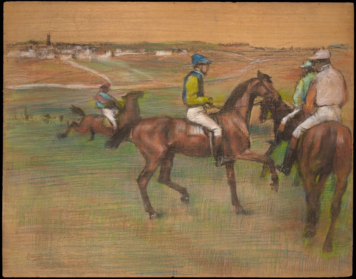
Edgar Degas, Race Horses, 1885-1888, pastel on wood panel.
One final note on Degas. In my research on him I discovered that he said his artworks weren't spontaneous. He believed in careful observation and planning instead of relying on impulsive brushwork. His focus was on capturing the details and movement through deliberate effort, particularly in his paintings of ballet dancers and Parisian scenes.
In order to do this he was known for creating numerous preliminary sketches and studies for many of his works. He often made extensive use of sketches to plan and refine his compositions before executing the final pieces. I thought that was interesting, because I considered the Impressionists to be more impulsive, and his pieces invoke a feeling of spontaneity. But it turns out he was quite a planner.
Okay, moving on to a famous woman pastel artist.
Rosalba Carriera (1673–1757)
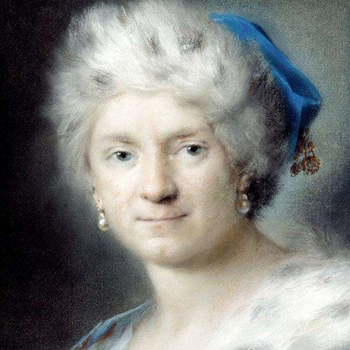
Rosalba Carriera, Self Portrait as Winter, 1731.
I had to reserach Rosalba once I found out about her. I mean, how cool is that? A woman pastel artist kicking rear in the 1600 and 1700s?
Rosalba Carriera was an Italian portrait painter and miniaturist, best known for her innovative work in the medium of pastel. She was born in Venice and began her artistic training under her father, a drawing master. Carriera gained recognition for her talent in portrait painting, earning commissions from the Venetian nobility.
In the early 18th century, she moved to Paris, where she became highly sought after for her pastel portraits. Carriera's use of pastels set her apart, and she contributed to popularizing this medium. Her clientele included European royalty and aristocrats.
However, as the Rococo style gained prominence, Carriera's delicate and restrained Rococo style fell out of favor. She faced financial difficulties later in life and returned to Venice, where she continued her work but struggled financially. Despite the challenges, Rosalba Carriera left a lasting legacy as a trailblazer in the field of pastel portraiture, influencing subsequent generations of artists.
She is recognized for her exceptional ability to create soft, glowing colors. She is also known for capturing the personality of her subjects.
Let's explore her artwork titled "Allegory of the Four Elements," which she produced between 1741 and 1743 as a commission.
During this period, allegorical series featuring four personifications, such as those of continents, seasons, or elements, were popular. These allegories take the form of close-up portraits, with attributes subtly placed (mostly on the lower right, except for Air), complemented by various colors and accessories to convey their roles.
For example, Air is depicted with a deep blue cloak and holds a bird by a thread; Water is shown contemplating fish on a fishing line; Earth displays grapes and a flower garland, resembling an allegory of autumn; and Fire, with tawny hair, wears rose and peach-colored garments while holding a small brazier. This pastel series demonstrates Carriera's skill in capturing the essence of each element with vibrant colors and symbolic details.
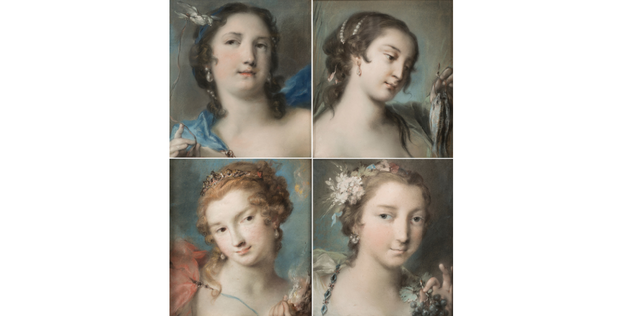
Rosalba Carriera, Allegory of the Four Elements, 1741-1743 (Air, Water, Fire, and Earth from left to right, top to bottom)
Carriera's color palette often featured gentle tones, with a preference for soft pastel hues and muted shades. Her ability to create nuanced color gradations and transitions added a sense of depth and realism to her portraits.
In her pastel portraits, Carriera demonstrated a keen understanding of the psychological impact of color. She carefully selected colors to convey mood, personality, and emotion. The softness of her color choices contributed to the overall elegance and grace of her works.
Odilon Redon (1840–1916)
Picture of Odilon Redon in 1880.
I’m taking a hard turn here for this artist, as his work is very different than Carriera.
Odilon Redon was a French Symbolist painter and printmaker, known for his unique and imaginative works. Born in Bordeaux, France, Redon initially studied architecture but turned to art, influenced by the Symbolist movement.
The Symbolist movement in art was a late 19th-century movement that emerged as a reaction against the naturalism and realism of the time. Symbolist artists sought to convey emotions, ideas, and spiritual concepts through symbolic imagery rather than direct representation. The movement was characterized by a focus on subjective experiences, dreams, and the mystical aspects of human consciousness.
Redon’s early works were mainly in black and white, characterized by a fascination with dark, fantastical subjects, and dreamlike imagery. Redon gained recognition for his series of lithographs titled "The Black Drawings" or "Noirs" in the 1870s, which showcased his interest in the mysterious and symbolic.
Below is a collection of works produced during this time. These works tended to be mysterious and melancholic. He was influenced by Edgar Allen Poe, Shakespeare, Darwin, and Franciso Goya’s darker works during this time.
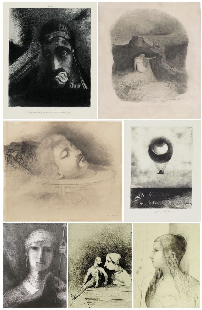
A collection of Odilons explorations of dark and light in his earlier works.
After the year 1890, Odilon Redon dedicated himself to exploring color extensively, utilizing both oils and pastels. This marked a significant shift in the tone of his art, transforming it from the dark and morbid to a more cheerful and delicate style.
During this period, he introduced floral studies and portrayed faces that seemed immersed in contemplation. Redon developed a distinctive palette characterized by vibrant hues, which was a departure from his earlier grim themes.
Redon's work influenced the Surrealist movement, and he is considered a precursor to modern abstraction. His contributions to the art world include paintings, drawings, lithographs, and pastels.
Let’s take a look at a couple of his later paintings to see how he used pastels.
Translated as "Figure Carrying a Winged Head (The Fall of Icarus)," this first piece reflects Redon's fascination with mythological and symbolic themes. The title suggests a connection to the classical myth of Icarus, who fell to his death after flying too close to the sun with wings made of feathers and wax.
In Redon's interpretation, the figure carrying a winged head might symbolize various themes, including the tragic aspects of the human experience. Redon often infused his works with a sense of mystery and symbolism, inviting viewers to interpret the meaning behind the imagery.
For this earlier pastel piece he used distinctive short strokes, showing minimal effort to blend, stump, or soften lines either into one another or adjacent color areas. I love how bright this piece is. He could really only achieve something like this using pastels.
Odilon Redon, Figure portant une tête ailée (La chute d'lcare), 1876.
Looking at another piece below - While Odilon Redon created numerous artworks featuring butterflies, one of his well-known pieces is "Butterflies" (c. 1910). In this work, Redon explores the symbolic and imaginative potential of butterflies, a motif that he frequently employed in his later period.
"Butterflies" exemplifies Redon's fascination with the mystical and transformative qualities associated with these delicate creatures. Again for this piece, he used vibrant colors. But he saved the more intense colors to render the butterflies and he faded the colors towards the sky, which contributes to a dreamlike and contemplative atmosphere.
Butterflies, in the context of Symbolism, can represent themes of transformation, metamorphosis, and the ephemeral nature of life. Redon's use of butterflies in his art aligns with his broader exploration of the fantastical and spiritual dimensions of the human experience.
As with many of Redon's works, interpretations of "Butterflies" may vary, and viewers are encouraged to engage with the piece's symbolism and aesthetic qualities. The painting serves as a testament to Redon's ability to evoke emotional and contemplative responses through his use of imagery and color.
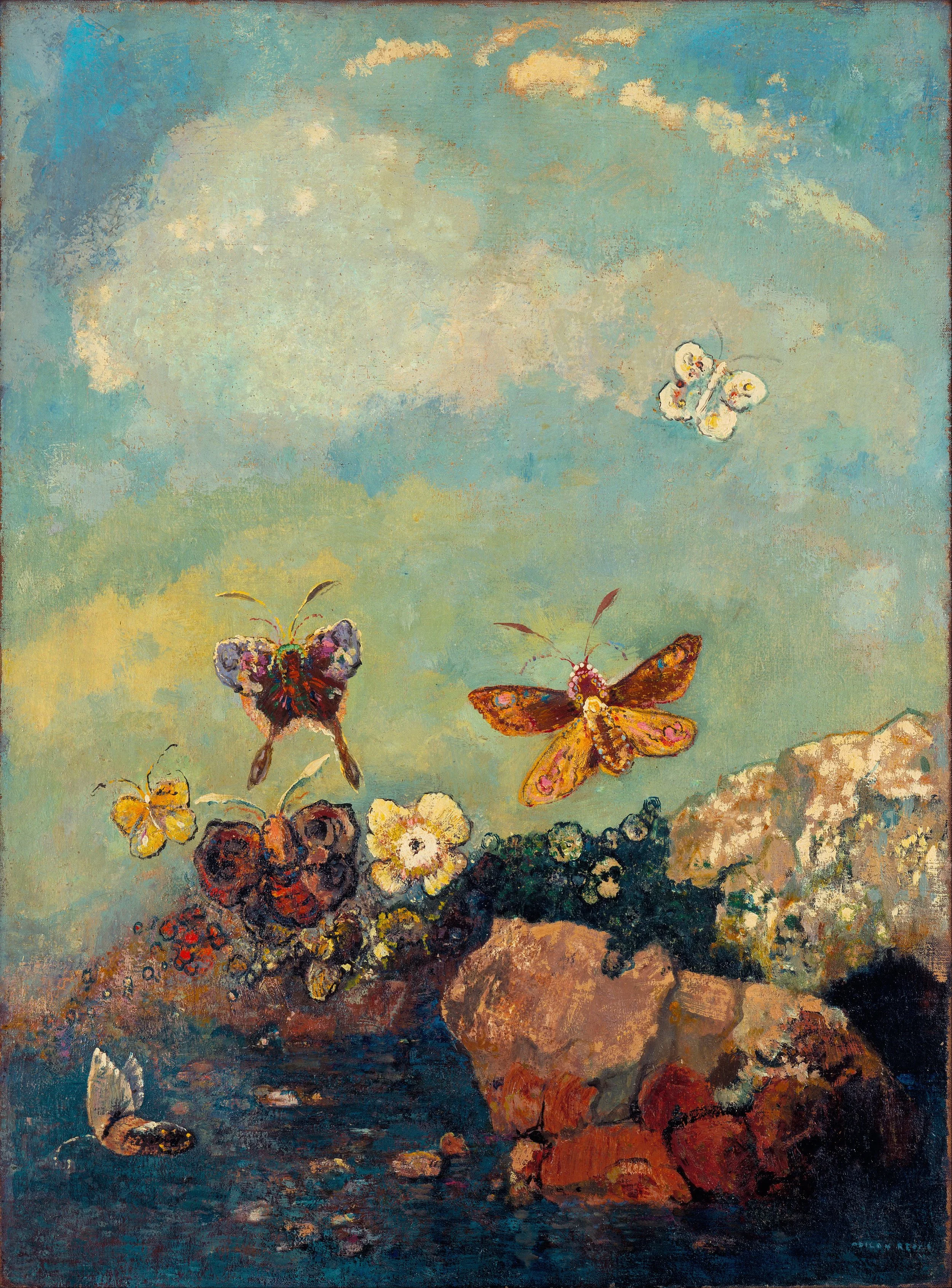
Odilon Redon, Butterflies, 1910.
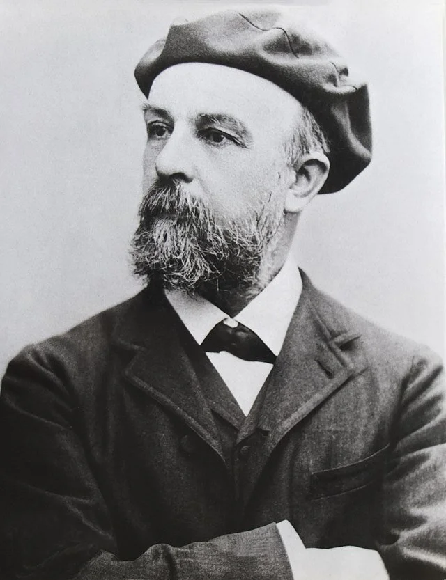
Henri Toulouse-Lautrec (1798–1863)
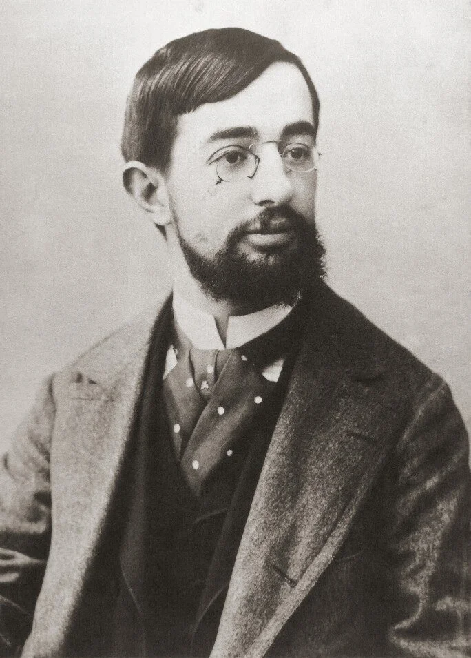
Henri Toulouse-Lautrec, photograph by Paul Sescau, 1858 - 1926, a professional photographer and friend of Lautrec.
Henri de Toulouse-Lautrec (1864–1901) was a French painter, printmaker, and illustrator associated with the Post-Impressionist movement. Born into a noble family in Albi, France, Toulouse-Lautrec faced health challenges from an early age due to a genetic disorder (due to inbreeding in his family), which limited his growth and influenced his appearance. Despite these challenges, he pursued his artistic passion with determination.
Toulouse-Lautrec moved to Paris and immersed himself in the bohemian and vibrant atmosphere of the Montmartre district. He became closely associated with the nightlife of Paris, particularly the cabaret and entertainment scenes. Toulouse-Lautrec's keen observations and unique perspective led him to create iconic works that captured the essence of the Moulin Rouge and other popular venues.
He was a prolific artist, creating paintings, posters, lithographs, and drawings. His distinctive style featured bold lines, expressive colors, and a focus on the human form. Toulouse-Lautrec's work often portrayed the performers, dancers, and patrons of the Parisian cabarets with a combination of empathy and a touch of melancholy.
Some of his most famous works include posters such as "Moulin Rouge – La Goulue" (see below) and "Divan Japonais," which are celebrated for their innovative design and capturing the spirit of the entertainment venues. Toulouse-Lautrec's art had a profound influence on the development of modern advertising and poster design.
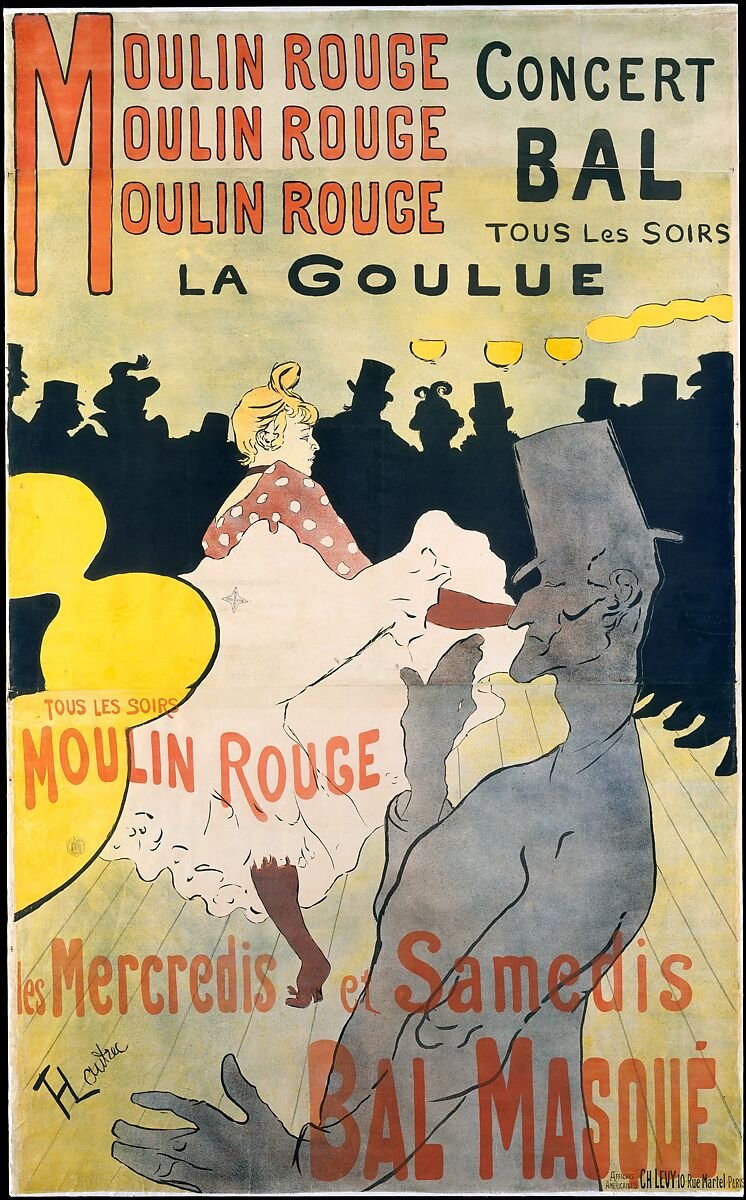
Henri Toulouse-Lautrec, Moulin Rouge – La Goulue, 1891, Lithograph printed on four sheets of paper. This commissioned poster made him famous over night and launched his career as a poster maker.
Tragically, Toulouse-Lautrec's life was cut short at the age of 36 due to complications related to alcoholism and syphilis. Despite the brevity of his career, his artistic legacy remains significant, and he is recognized as a pioneering figure in the Post-Impressionist movement and a key contributor to the cultural and artistic milieu of late 19th-century Paris.
I had to include this piece below (if you know me, then you know I love Van Gogh!). Lautrec used pastels to paint a picture of Vincent Van Gogh as he sat at Cafe Tambourin in the Montmatre district of Paris. He is leaning forward as if he is conversation with someone with a glass of absinthe infront of him on the table. This was a daily habit for him when he lived in Paris.
Lautrec met Van Gogh, who was eleven years older, at Fernand Cormon’s studio where they were both taking lessons. They likely worked together for a while, as their paintings from that period look very similar. The piece below reminds me of Van Gogh’s painting style with the obvious unblended strokes of blues, greens, yellows, and oranges.
I liked this story about Lautrec-at the exhibition of ‘Les Vingt’ in Brussels in early 1890: Van Gogh's six paintings caused a commotion during the opening, and Toulouse-Lautrec almost got into a fight defending him. They may have seen each other one last time a few months later when Van Gogh visited his brother Theo in Paris from Auvers-sur-Oise. Other than that and this painting, little else is known about their friendship.

Henri Toulouse-Lautrec, Portrait of Vincent Van Gogh, 1887, pastel on cardboard
Let’s look at one more of Lautrec’s pastel works. This painting, “Salon de la rue des Moulins”, depicts the daily life of prostitutes in the brothel. Here we see six women, five of them are sitting on the red couches, and another one is walking. Lautrec chooses to show in-between moments, while other painters tended to portray brothels as places for pleasure and entertainment.
Lautrec liked to hang out with the people who others thought to be unsavory. This is probably because of his physical and mental challenges. He was ostracized by many in society, and he felt at home with the people in the rowdy side of Paris.
Lautrec does not judge their work but tells about it. Three women sitting behind are dressed and probably waiting to see clients. The two prostitutes in front are dressed in the home clothes, and it seems they are expecting medical checkups, as can be seen from another woman walking into the room with her dress raised.
This piece is typical of his style which includes oversimplification of forms, sketchy lines, accent on bright colors, rough and incompleteness of his artworks. The colors are incredibly intense: many shades of red, black, blue, greenish and yellowish, and ocher. The silhouettes of women are well-defined; however, not all parts of their bodies are precise. He pays attention to their hairstyles and dresses but, in a way, ignores their faces and shapes, as they appear to be very much alike. The strokes are blended, thin, smooth, and flat. The overall impression is that Lautrec focuses more on the room interior than on the women that raises many questions of what he aimed to say.
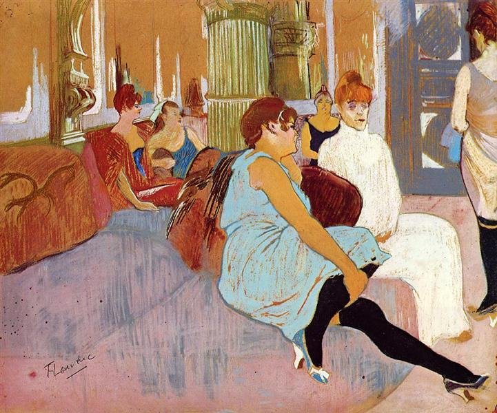
Henri Toulouse Lautrec, Salon de la Rues Des Moulins, 1894-1895, pastel on cardboard
4 Tips We Can Learn From the Masters
That sums up a few pieces from the four masters. Let’s take a look at how we can use their influence to improve our own pastel artworks.
Expressive Use of Color-
One of my favorite characteristics of soft pastels is that they are very punchy with their color. Especially pastels such as Unison. They provide much more vibrant hues than colored pencils. Because of that, we can really use them to our advantage similar to how the masters I have examined did.
Here are a few ideas:
Carriera was exceptional at creating subtle, glowing color in her portraits. If you are into drawing people, you could study how she used smooth transistions and a soft palette to render her subjects. Copy one of her portraits trying to determine her color scheme.
Degas strategically used color to accent certain parts of his paintings. Consider using color in your own artworks to draw attention to portions of your piece.
Redon and Toulouse-Lautrec were both known for their bold and expressive use of color. Redon used color to tell a story. He selected color for its meaning. You could select a subject and change the colors of the subjects to provide meaning to your next work.
Toulouse-Lautrec had an ability to convey mood and atmosphere through vibrant and unconventional color choices. Experiment with a diverse color palette to add dynamism to your work. Use color in new ways that you haven’t considered before.
I am currently learning how to think about color differently within my own pieces. I am a realist artist, but I want to explore using less traditional colors to render animals and landscapes. Now that I have figured out how to make things look like a photograph, I think it’s time to move on to more creative pastures and borrowing ideas from these master artists and experimenting will help me to grow as an artist.
Capture Movement and Gesture-
Degas excelled in capturing the movement and gestures of his subjects, particularly in scenes of ballet dancers and horse races. His use of quick, gestural strokes conveyed energy.
Degas also cropped compositions and focused on pecific body parts and varied poses, emphasizing the expressiveness of each movement. His deep understanding of anatomy allowed for accurate portrayals, while layering and blending techniques added three-dimensional depth. Degas' keen eye for natural body language and his ability to capture candid moments contributed to the lifelike and dynamic quality of his pastel figures, making his work a testament to the art of implying gestures.
Henri de Toulouse-Lautrec masterfully implied movement in his pieces through dynamic poses, blurred outlines, and overlapping figures. His keen attention to capturing specific gestures, combined with the use of flowing lines, conveyed a realistic sense of motion.
By selecting subjects engaged in activities associated with movement and strategically arranging elements within the composition, Toulouse-Lautrec created artworks that vibrantly captured the dynamic energy of dancers, performers, and lively social interactions. The artist's innovative techniques, including the incorporation of background elements, contributed to the overall impression of movement, making his pieces visually engaging.
In order to create movement in an art piece consider taking one or more cues from Degas and Toulouse- Lautrec:
Depict a scene that has movement, such as a running person or animal.
Use gestural strokes to depict movement.
Make sure that your anatomy is correct to give the illusion of proper movement.
Consider cropping the subject to give the impression of a snapshot in time.
Expressive Mark-Making-
Soft pastel masters often use expressive and varied mark-making techniques. Degas, Redon, and Toulouse-Lautrec all used varying strokes in their pieces.
Looking back at the Toulouse-Lautrec works I showcased, he scribbled lines, filled in areas entirely with one color avoiding the look of shadow, used strong outlines for subjects, and let the paper or canvas show through at times.
Rodin drew thicker marks at times and did not blend them in. He also used large blocks of color lacking shadows.
Degas also used unpolished lines and gestural strokes to create his artworks.
To experiment using their example:
Use different strokes within one piece, from bold and gestural to delicate and fine.
Embrace the diversity of marks to convey emotion and energy in your artwork. Try hatch marks to fill in color, bold lines instead of shadows, squiggle lines to denote movement, dots to signify points of light, etc.
Consider using scribble lines and not finishing portions of your piece that are not as important.
Composition and Design-
Degas liked to design compositions that captured movement of dancers or horses. His pieces remind me of a candid photograph. But he also meticulously planned his compositions. You can find many drawings that he created before he started a piece. He was trying to work out what would make the most pleasing arrangement.
This is something I could use some work on. I must admit I am rather impulsive. I figure out what I want to draw and then I go straight to the paper with the intent of creating a lovely work. I think it would help me to grow as an artist if I played with composition more before I begin a piece. A little while back I actually wrote several blogs on composition. They might be worth revisiting. You can check them out here:
Part 1 - How to Create a Pleasing Composition of Art: The 7 Elements of Art
Part 2- How to Create a Pleasing Composition of Art: The 8 Principles of Art
Part 3- How to Create a Pleasing Composistion of Art: 6 Composition Strategies
Rebel Artists- Breaking Composition Rules
Another thing that stands out to me regarding especially Toulouse-Lautrec and Rodin is that they were both influences by Japanese prints. This is pretty clear when you look at their work which lacks shadow and includes thick lines to outline some subjects.
Here are a few takeaways to think about in terms of composition and design:
Take some time to plan out your next piece. Create thumbnail sketches or even quick large sketches to help plan out a better composition.
Create a work that is reminiscent of a Japanese print. Use bold colors, strong dark outlines, and render less shadows.
Analyze the compositions of pastel masters. Copy a master work to get into the head of the artist. That’s how they used to learn!
Consider their choices in arranging elements, creating focal points, and establishing balance.
Learn how to lead the viewer's eye through effective design principles.
By studying the techniques and approaches of soft pastel masters, artists can gain inspiration and refine their own skills. Remember to combine these lessons with your unique perspective and personal expression to develop a distinctive artistic voice.
Conclusion
In this blog, I've delved into four key lessons we can glean from pastel masters like Rosalba Carriera, Edgar Degas, Odilon Redon, and Henri de Toulouse-Lautrec to enhance our own pastel artworks. From the expressive use of color, capturing movement and gesture, expressive mark-making, and composition and design. Incorporating a few lessons we learned from them, you can infuse their pastel works with newfound creativity and growth.
Did I miss any ideas from the master artists? Did I overlook your favorite pastel artist? Love to hear your thoughts in the comments.